Heuristic Evaluations
While conducting the Heuristic evaluations, the main issues that we wanted to address were how it looks unreliable, the Icons are confusing, and the information feels overwhelming and placed wrong.
Target Audience
The target audience that we want to try and empathize with are young students who need to find off campus housing but also need support in this part of their life. The user is most likely new when it comes to off campus housing and living independently, so they might feel overwhelmed and a little bit anxious
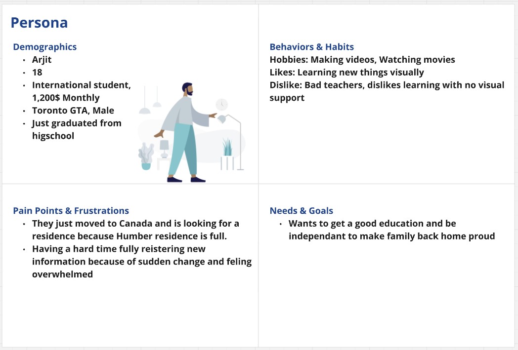
User Persona
Our main persona is Arjit Singh, a young international student who just graduated high school and moved abroad for higher education. He struggles to find temporary housing due to the overwhelming stress of the transition and information overload.
Inspiration
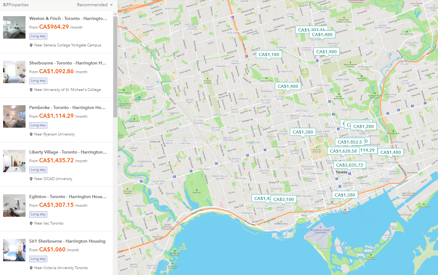
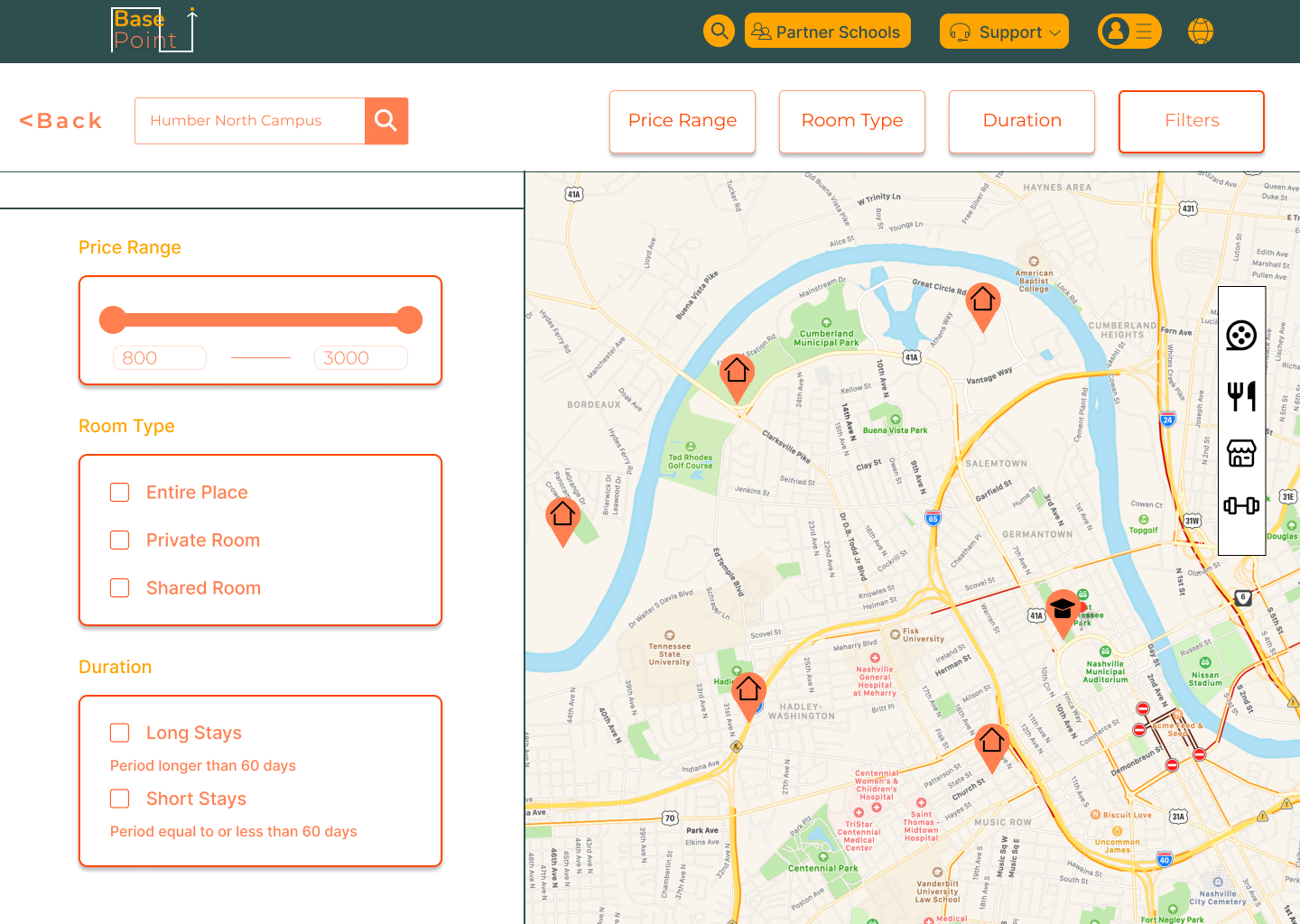
Before creating the user flow, we first looked at a site that was similar to Places4Students to see what we could use as inspiration. Such as the fact that when searching for a home, there is a map mainly covering the whole screen to help you pinpoint an exact location that you want to look for, alongside with some helpful and easily accessible filters to help narrow down your choices based on your needs.
Creating Prototype1
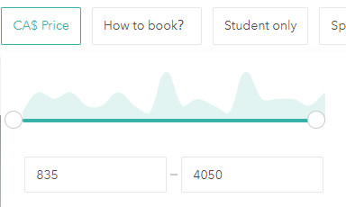
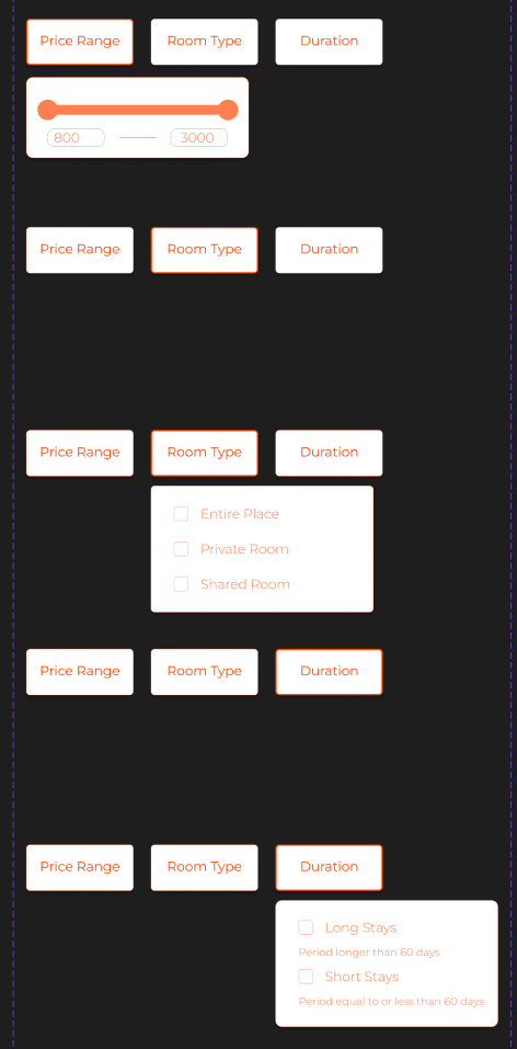
When we started creating the prototype, I mainly worked on the interactive components, the navigation, and also the layout. I spent a lot of time on the interactive components since I was still learning how to use Figma and wasn't familiar with some of its features yet. An example would be working on the filters for finding a house both on desktop and phone. I wanted the filters to look as easily accesible as possible and open to the user to try out. I even added a feature where you could see your filter options all at once if you don't feel like pressing each individual button.
Creating Prototype2
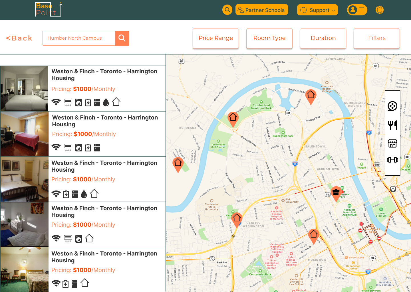
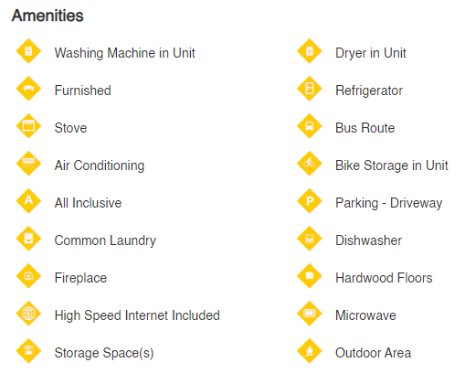
I also helped with organizing the Amenitites and making the icons bigger and easier to see because the previous design had very small icons that were hard to see. I also added sections to help categorize the icons and help the user in navigation all of the different icons.The picture on the left is the old design and the picture on the right is the new design
Final Result
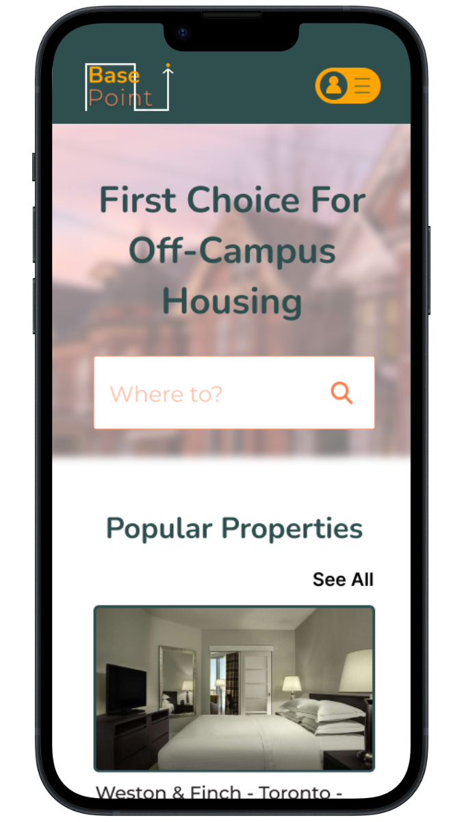
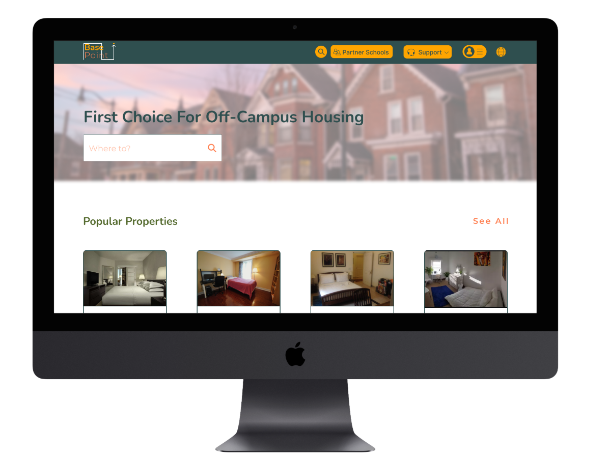
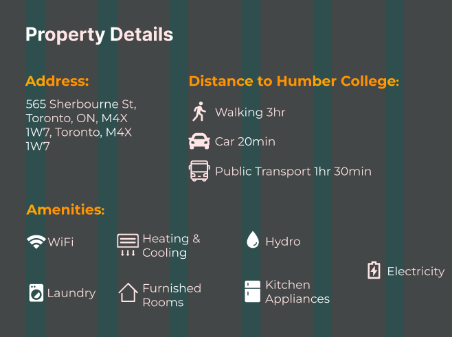
We completed the final prototype and accomplished what we set out to do, which was making the site look more reliable and fixing the way items are placed. Below is the link to the desktop and mobile version.