Interactive Elements and Navigations1
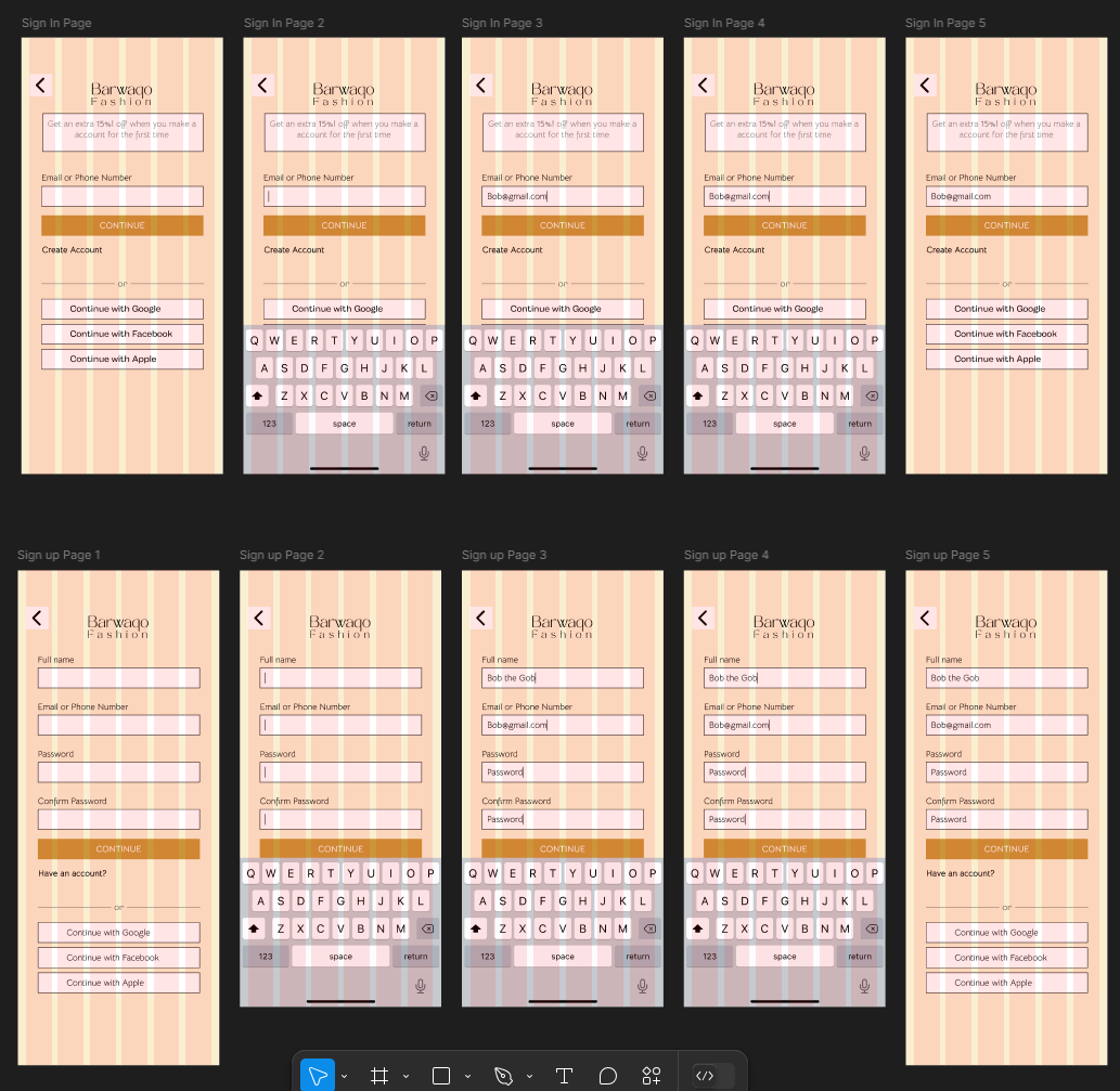
I started with creating responsive inputs that would make the keyboard appear with a sliding animation. But I also wanted to make the experience feel more real by also making it so that when you press the keyboard, the information will appear on the inputs and only then can you move on to the next page. By adding these features, it makes the experience all the real and engaging for the user because people also have these experiences with other apps.
Interactive Elements and Navigations2
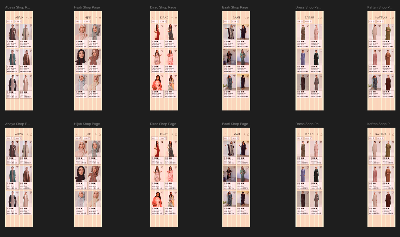
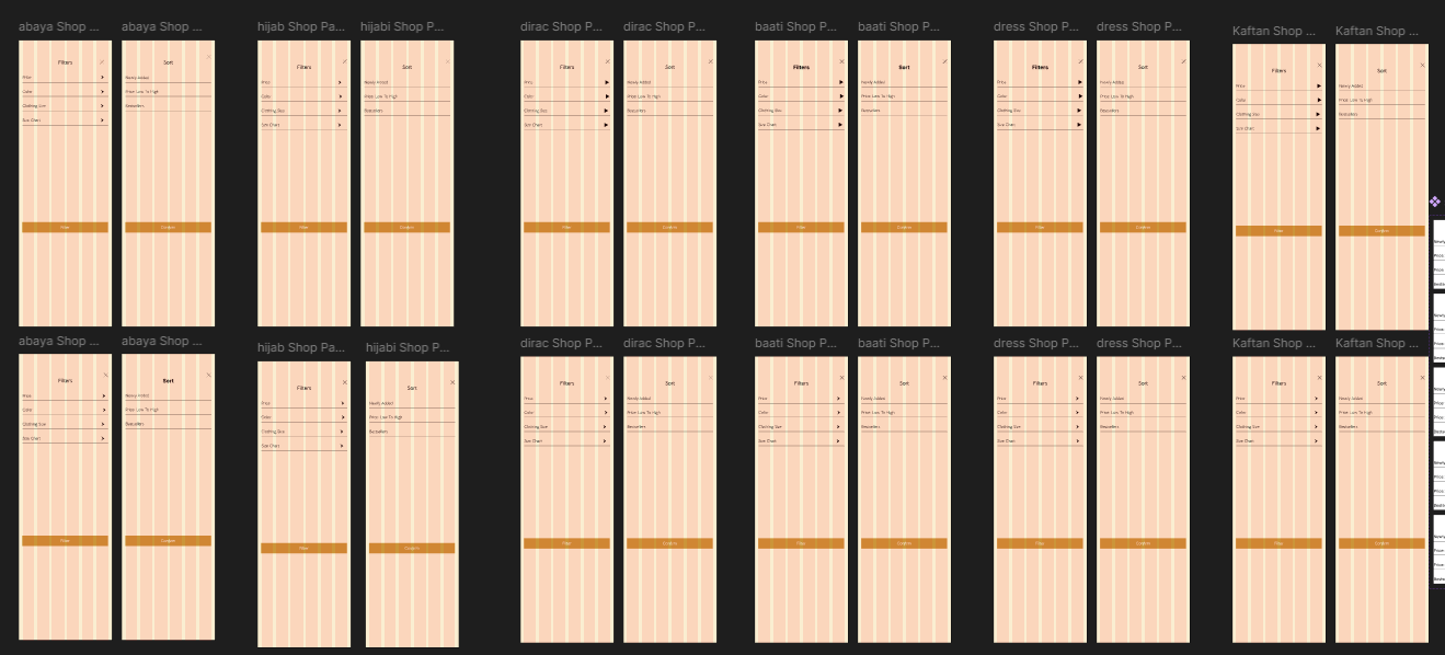
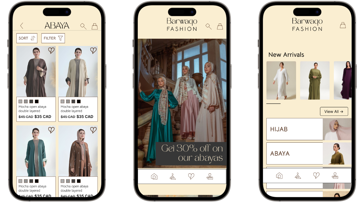
After spending a while figuring out how some aspects of Figma works, I then worked on making each of the different clothing pages respond to the filter buttons and also the like buttons. This took a lot of time because I had to repeat the same process when it came to the responsiveness for each of the 12 different pages if you also include their liked versions because there had to be each filter page just dedicated to one clothing page because then there would be problems.
Interactive Elements and Navigations3
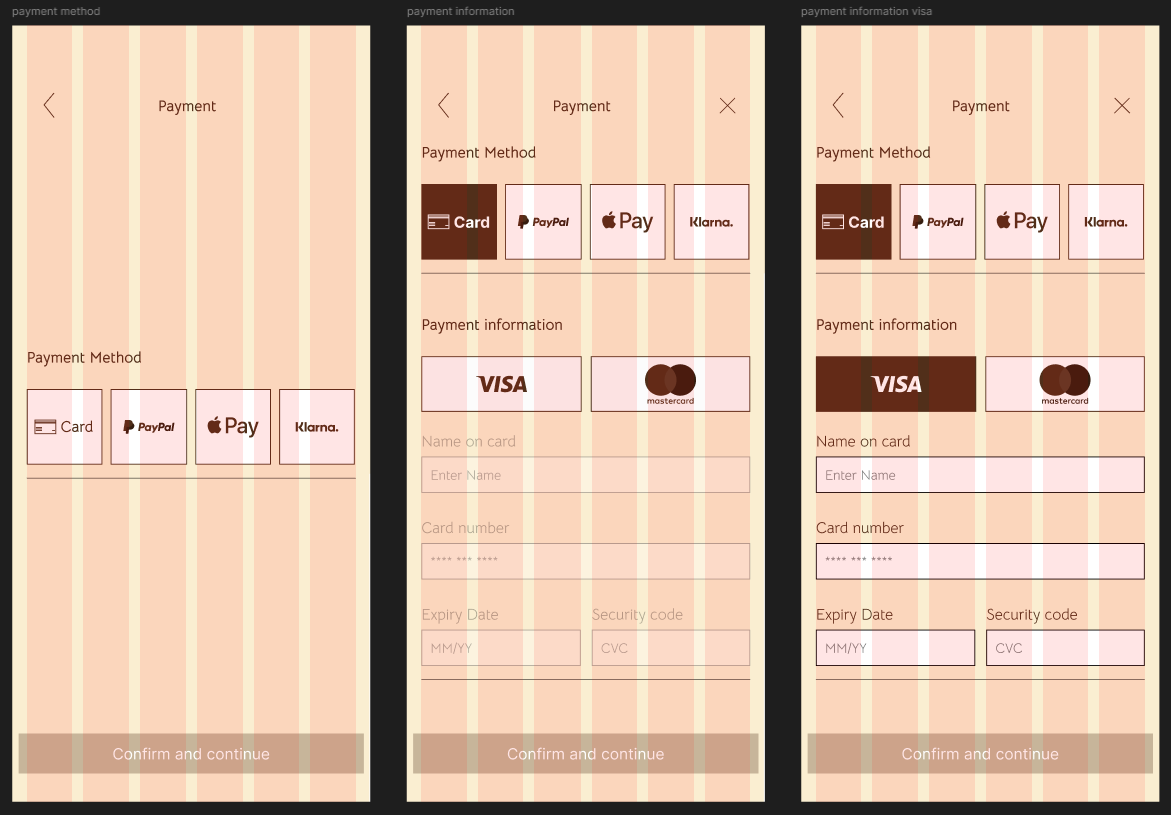
When it came to working on the navigation of the payment method, I wanted it to start off by just showing the visuals of the payment options, so the user doesn’t feel overwhelmed at first when making the transaction. Once they choose the payment method, there will be an animation of the rest of the content sliding down from the top to make it feel more like you are making transaction in a native app instead of just on web app.
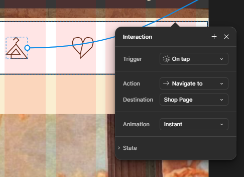
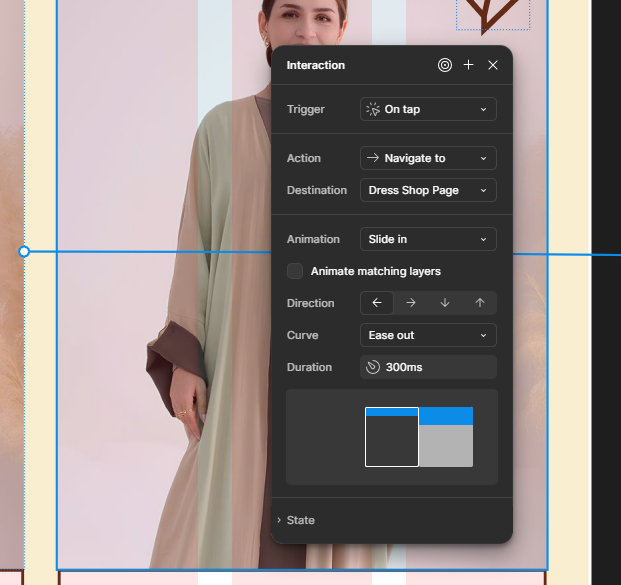
Interactive Elements and Navigations4
I also made sure to know when to add sliding animations, or nothing when pressing to a different page because based on what type of button you press, there might be an animation or nothing. An example would be from other clothing apps such as Dynamite where I got the inspiration to add no animations when it came to pressing navigation icons but add left sliding animations for other buttons or up sliding animations for the filter button.
Final Result
We completed the native app, and I think I accomplished what I set out to do, which was making the navigation of the app feel interactive and fluid. Below is the link to the prototype.
High Fidelity Prototype:
Try it out now!